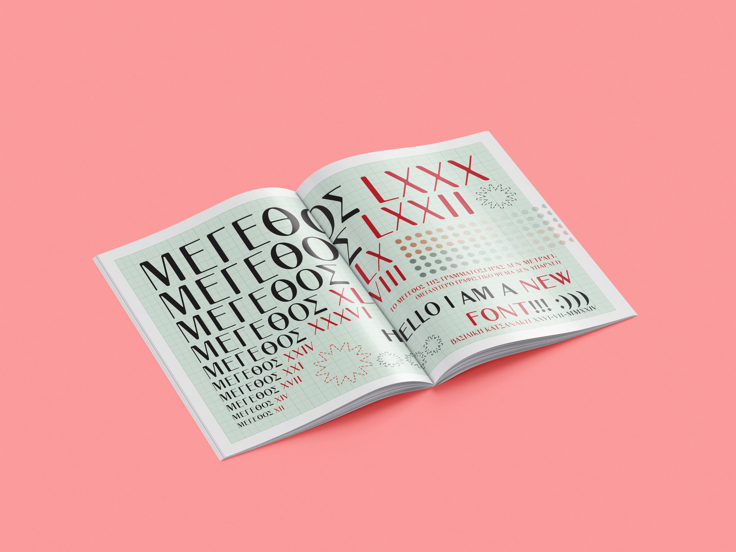
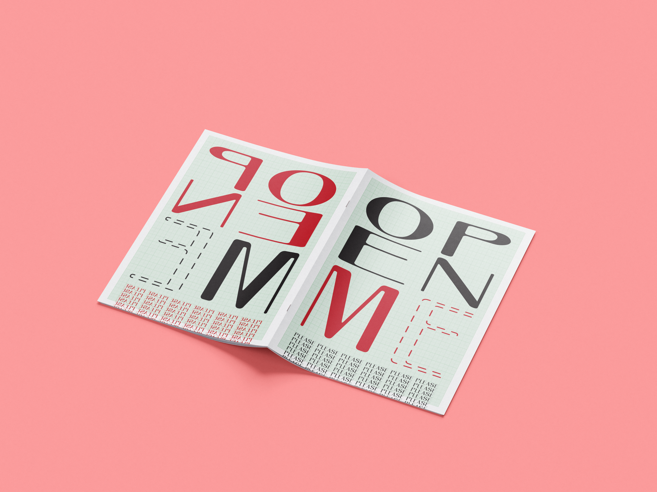
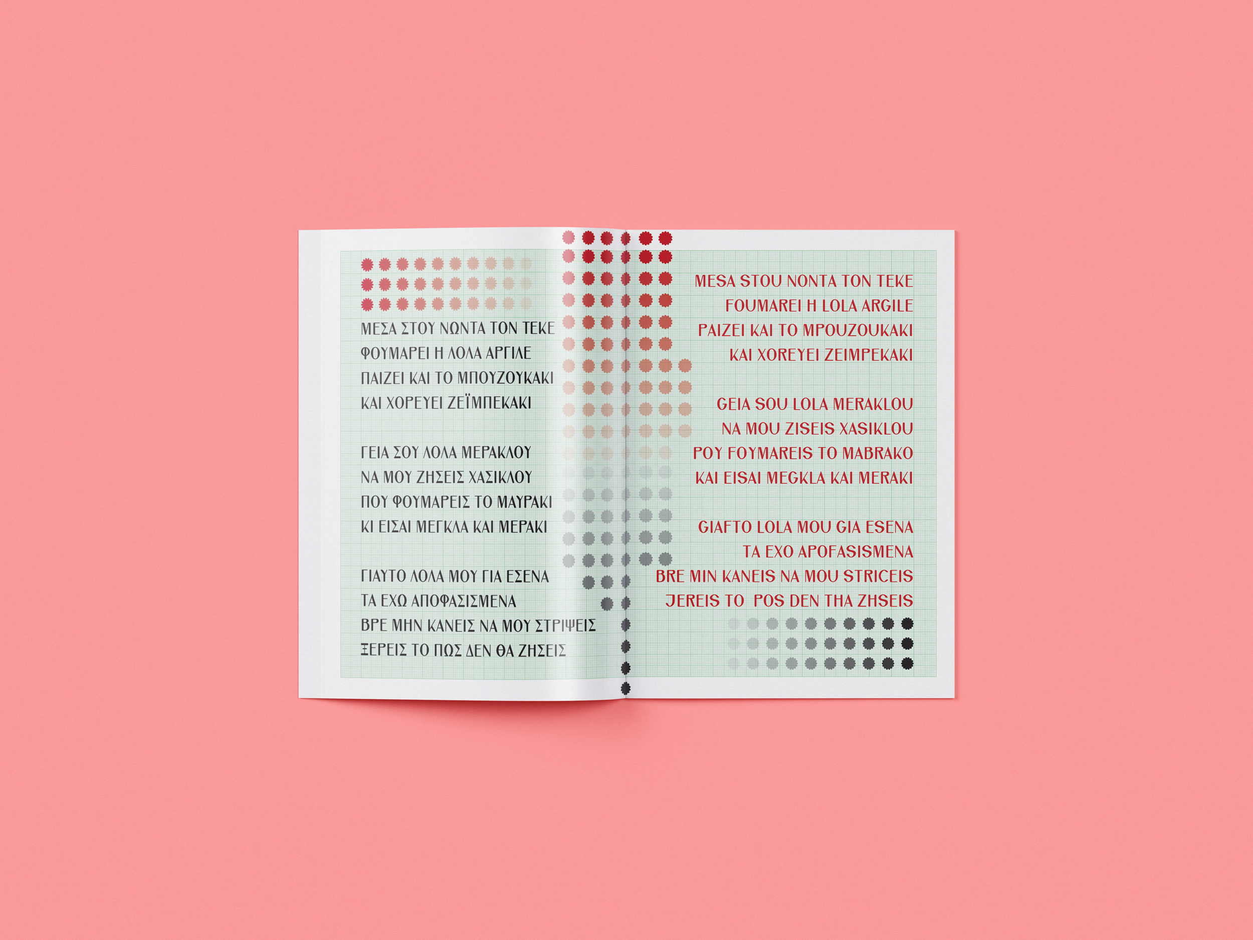
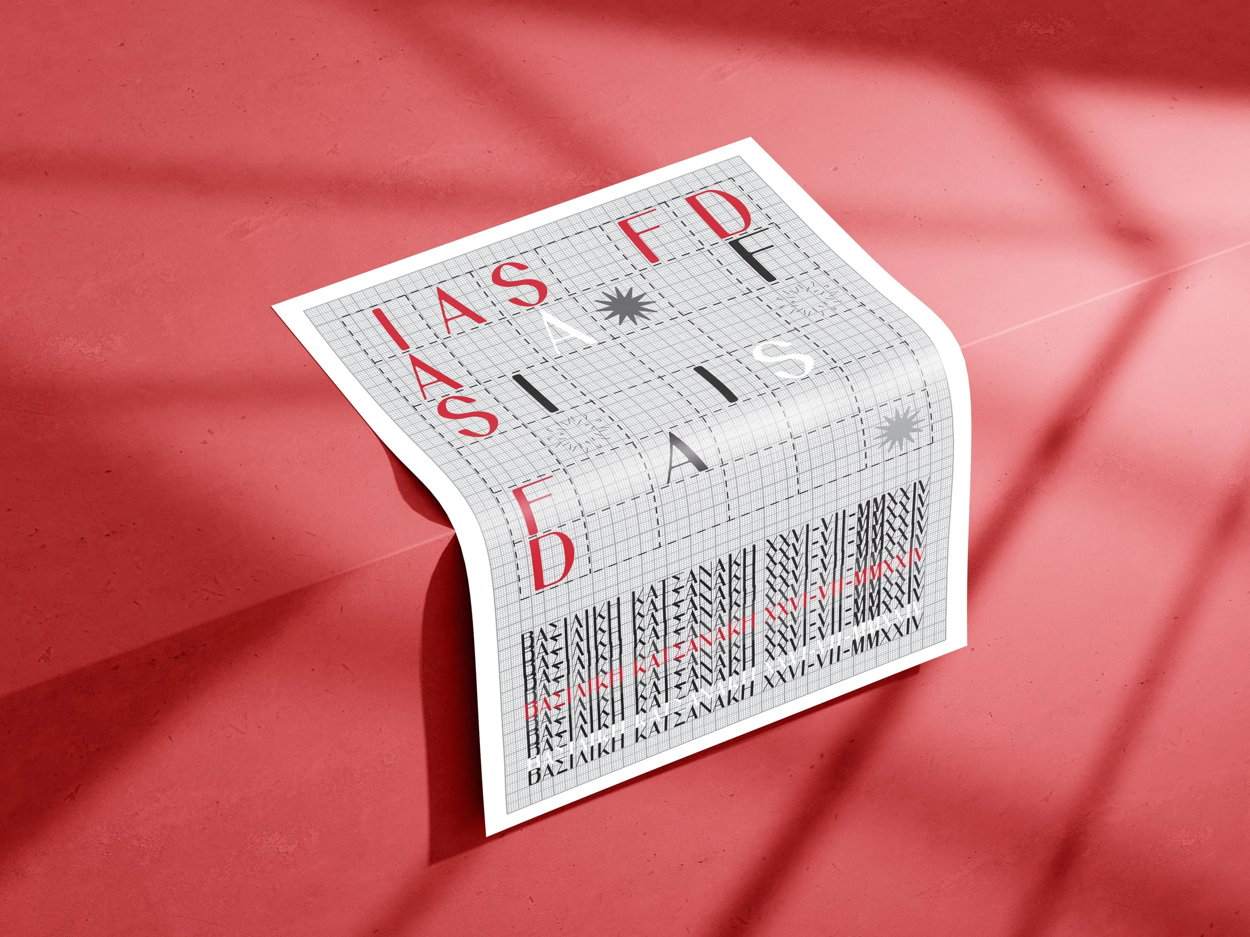
IAS FD // An original Font

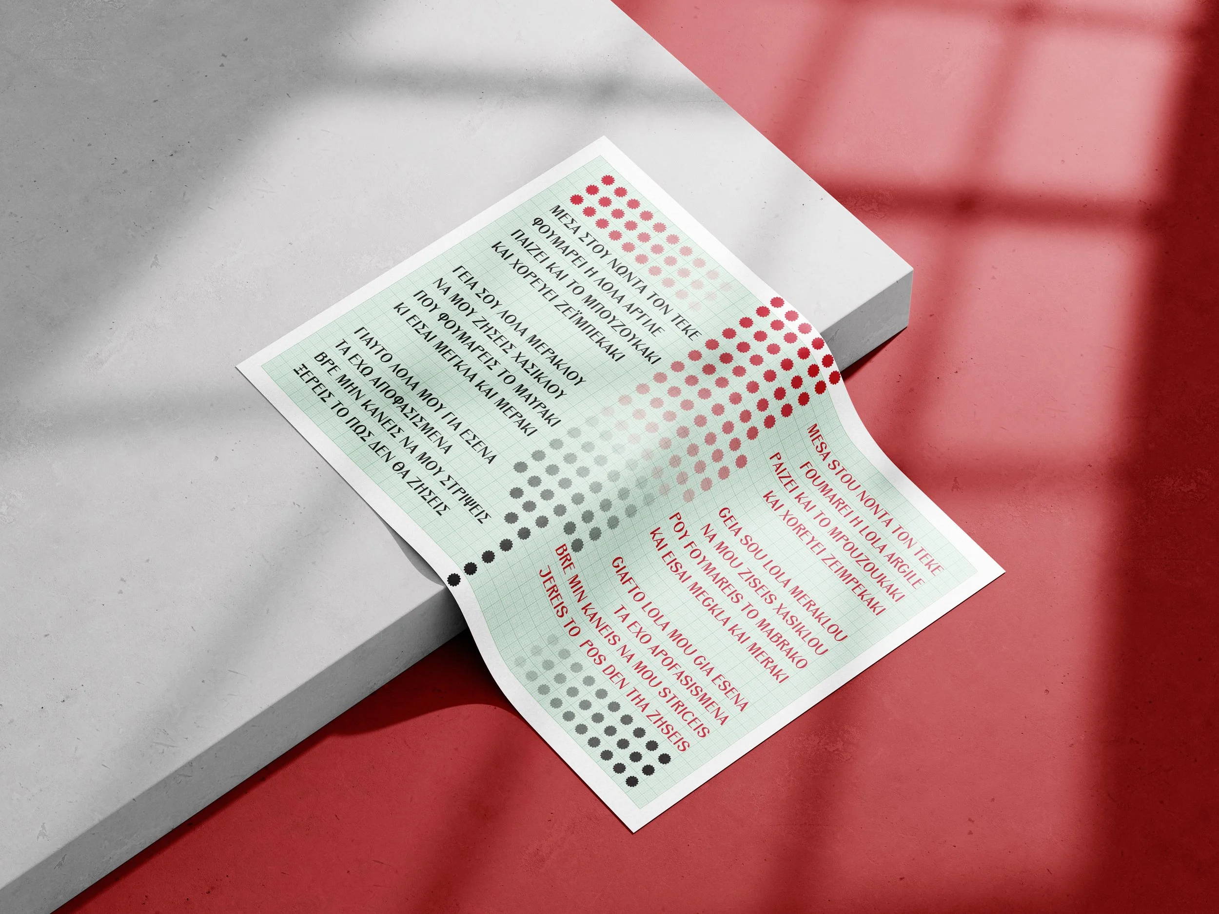
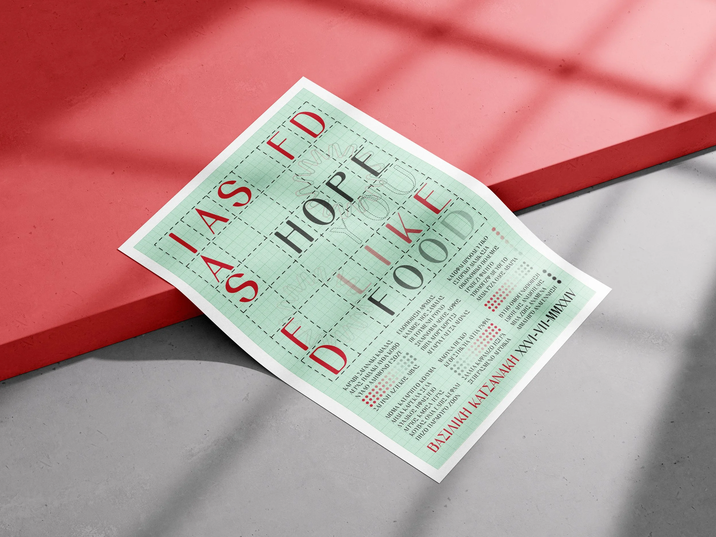
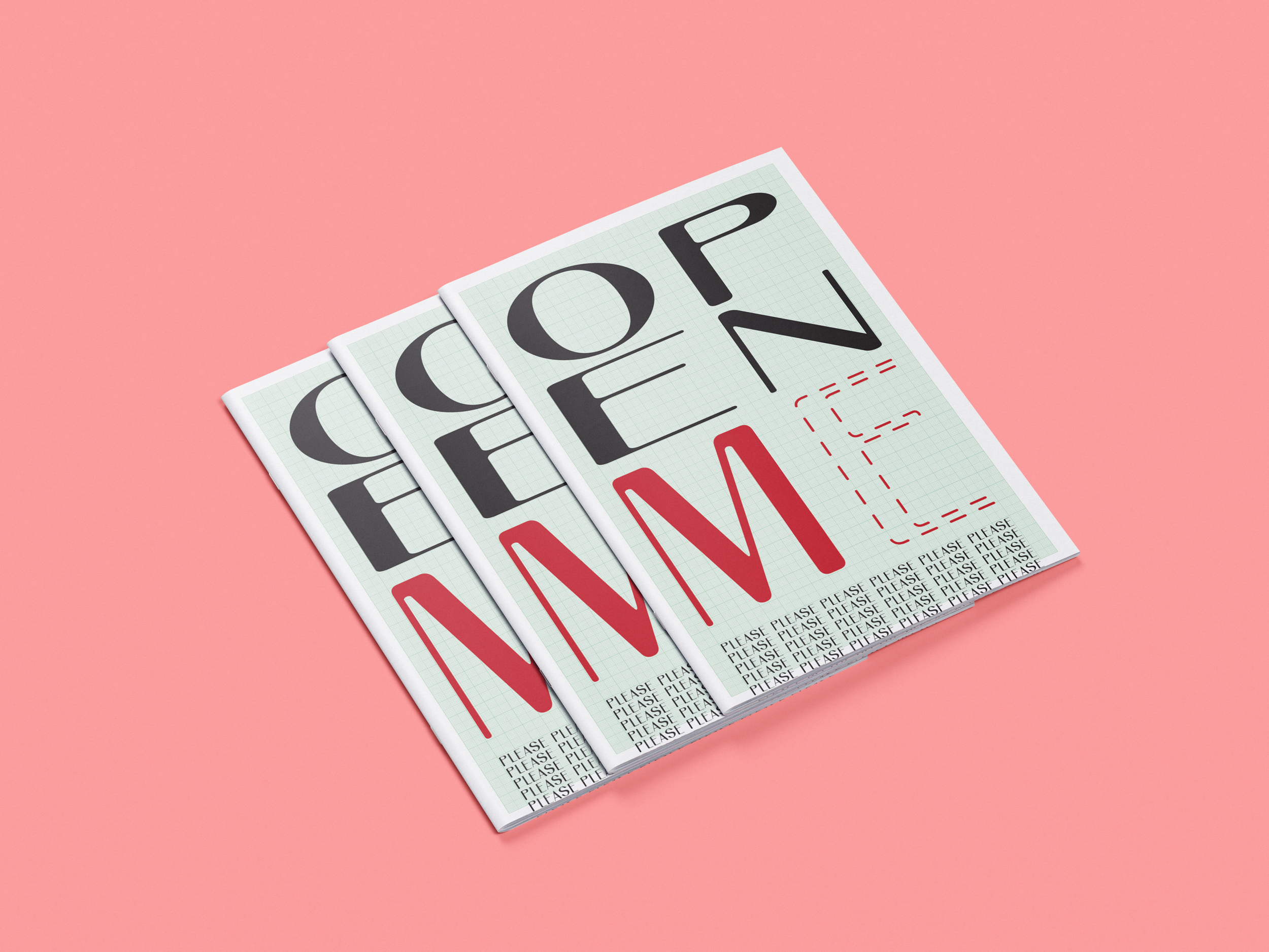
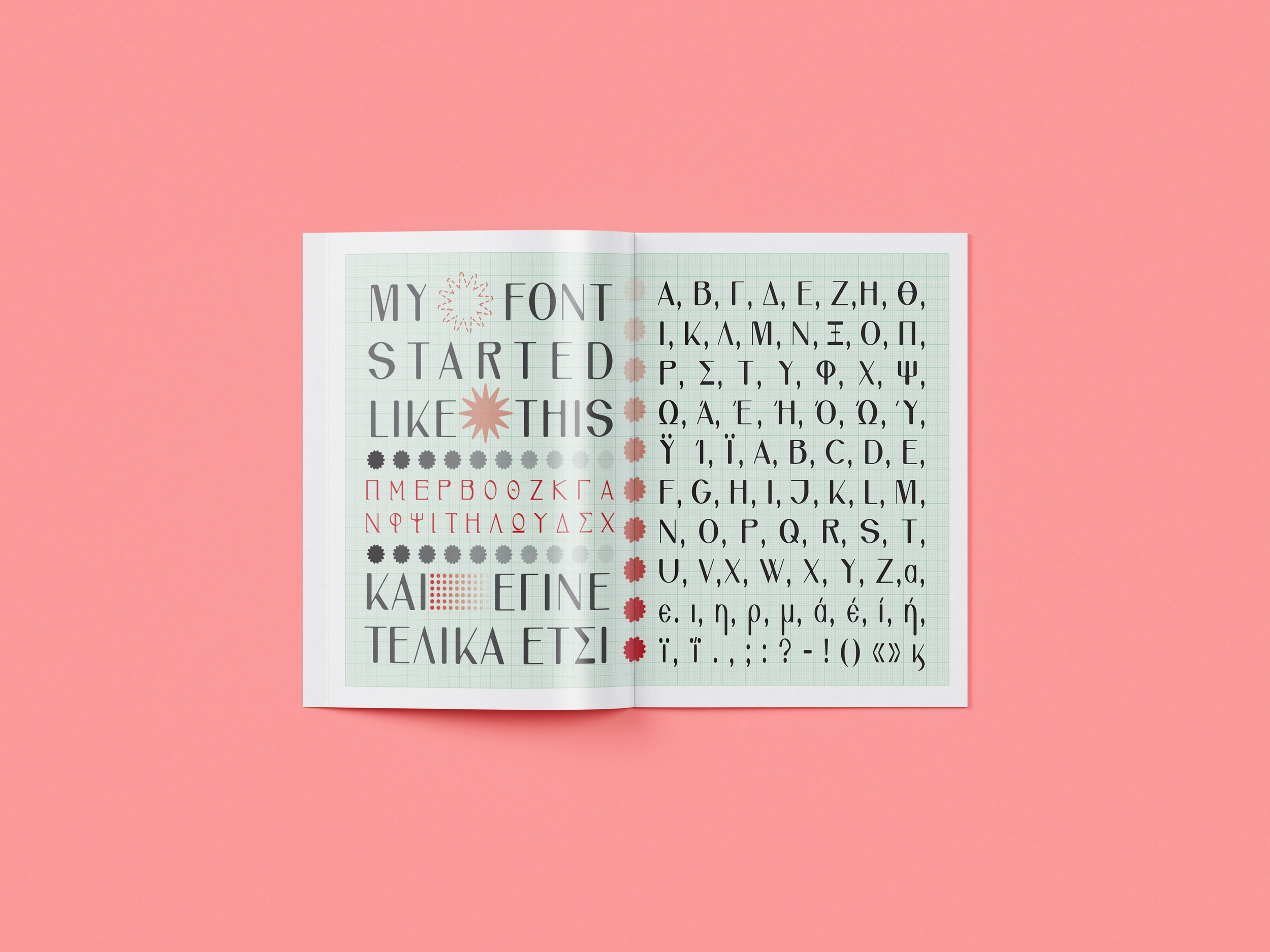
Typography has always been one of the things I enjoy experimenting with, so I decided to try creating my own font. I started playing with letter shapes, proportions and contrasts, taking inspiration from classic serif typefaces while trying to give the letters a character of their own. What began as a small experiment slowly turned into a much bigger project, exploring how familiar shapes could be changed and brought together in a new way.
Personal Notes & Reflection

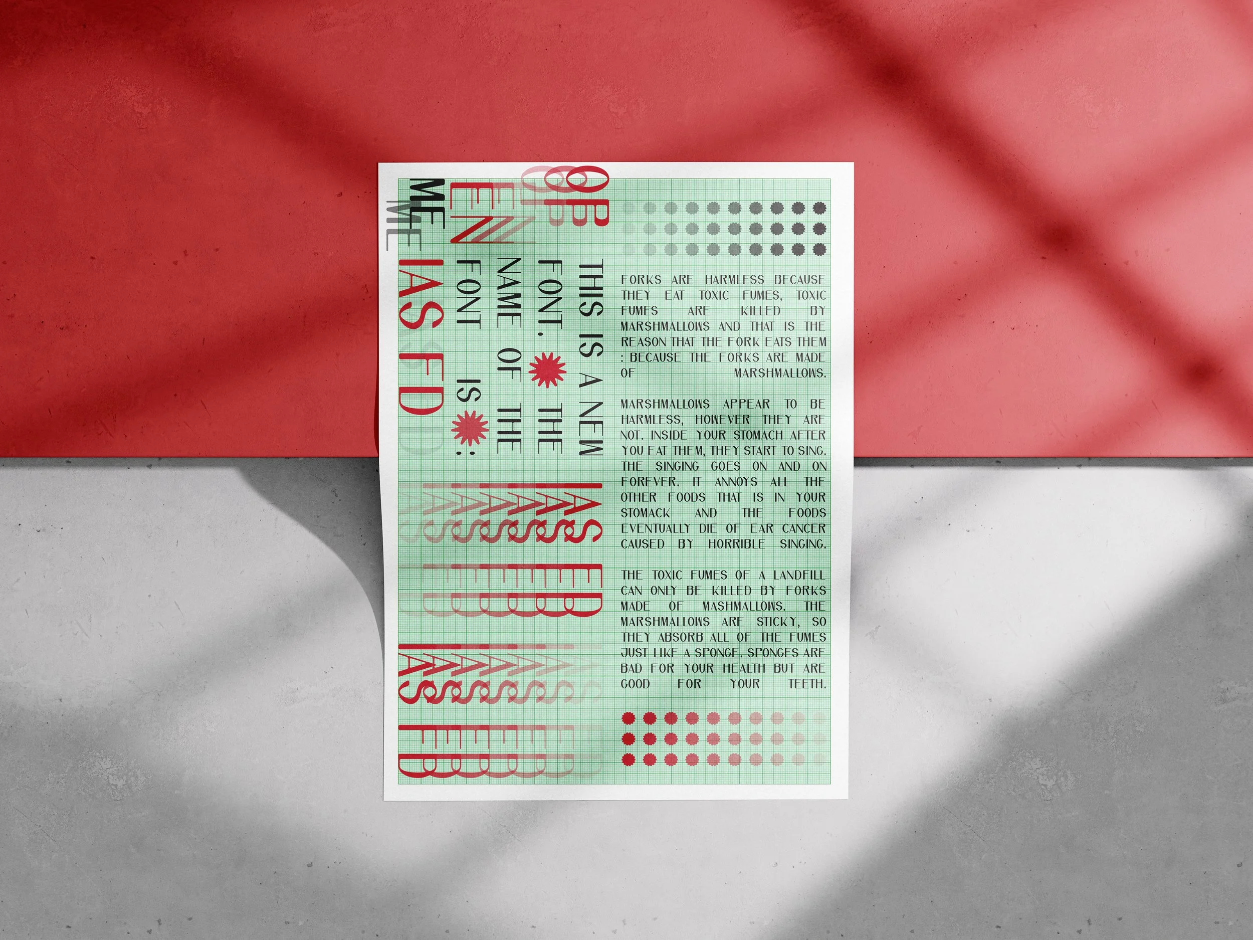
This project started as an experiment driven by my curiosity about type design. Inspired by classical serif typefaces such as Walbaum and GFS Didot, I explored the contrast between thick and thin strokes, elegant proportions and delicate details, while trying to give the letterforms my own character.

I quickly realised that designing a typeface involves much more than drawing an attractive alphabet. Every curve, spacing decision and small adjustment requires time, patience and precision. Even the simplest-looking letters hide an incredible amount of work.

This experience gave me a new appreciation for professional font designers. I now understand how demanding and detail-oriented this craft is, especially for those who dedicate their entire careers to it. I have the highest respect for their work and the patience it requires.

It was a small experiment, but a valuable lesson in looking at typography differently.

Previous
Previous

Open House 2025 // Poster Competition Entry

Next
Next

Bachelor's Thesis Project 2024